Why Your Character’s Silhouette Matters More Than You Think
A character silhouette is the recognizable outer shape of a character—the outline formed by their body, clothing, posture, and carried objects. It matters because audiences often need to identify a character before they can see facial details, read dialogue, or learn their backstory. In animation and visual design, a clear silhouette supports instant recognition, readable action, and memorable characterization. This guide explains how silhouette works, how designers test it, how shape and costume communicate personality, and how examples from animation and games show its practical value.
Character Silhouette Clarity Supports Recognition and Readability
A character silhouette is the simplified contour that remains when a figure is filled in as a single solid shape or viewed without internal detail. It includes more than anatomy: hair, clothing, props, pose, and the spacing between limbs all affect the outline. Animation educator and author Walt Stanchfield emphasized clear, expressive drawing in his teaching at Disney; his notes, later collected in Drawn to Life, repeatedly encourage artists to make poses and actions communicate clearly. A strong silhouette applies that principle by making the character’s design legible at a glance.
Silhouette clarity matters across media, though it is especially visible in animation, comics, games, and small-screen viewing. A character may appear briefly, move quickly, overlap with other figures, or be reduced to a thumbnail. In those conditions, surface detail is easily lost, but a distinctive outline can remain. Silhouette is therefore not a substitute for color, facial expression, or storytelling; it is a foundation that helps those other signals register.
Recognition Through Outer Shape
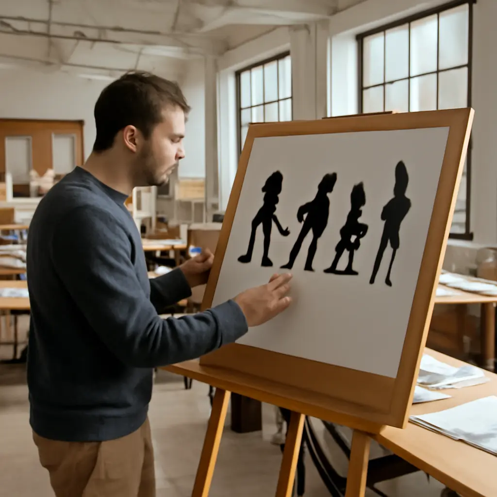
Recognition through outer shape means that viewers can distinguish a character from others without relying on facial features or costume patterns. Designers often test this by filling the character with black and checking whether the figure remains identifiable. If two characters become indistinguishable in silhouette, they may need more variation in proportions, posture, clothing, hair, or props.
The test is a practical design heuristic, not a guarantee of audience recognition: familiarity, context, and repeated exposure also matter. Still, it helps reveal when a design depends too heavily on details that disappear at a distance or in motion. For instance, a tall, narrow figure with a long coat and a sharply angled hat may be easier to distinguish from a short, broad figure with a rounded hood—even if both wear the same color.
Action Readability in Motion
Action readability is the ease with which viewers can tell what a character is doing. A clear outline separates limbs and props from the torso, so a gesture does not collapse into an unreadable mass. When a character reaches, runs, fights, or holds an object, visible negative spaces—the gaps between arms, legs, and body—help explain the pose.
This is especially useful in animation and interactive games, where characters may be seen at small sizes or against complex backgrounds. Designers can check action readability by shrinking a pose, viewing it in grayscale, or briefly glancing at it. These checks do not replace motion tests, but they can quickly expose tangencies, merged limbs, or props that blend into the body.
Character Silhouette Shape Communicates Personality
Character silhouette shape communicates personality when proportions and contours suggest qualities such as confidence, vulnerability, speed, age, or menace. There is no universal visual dictionary in which a particular shape always means one thing. Interpretation depends on style and cultural context. However, artists can use shape contrast deliberately: broad versus narrow, angular versus rounded, upright versus slouched, or balanced versus asymmetrical.
The related design concepts include shape language, proportion, pose, and visual hierarchy. Shape language describes the repeated use of forms to establish a visual impression; proportion controls the relationship between body parts; pose shows attitude through body arrangement; and visual hierarchy determines which features attract attention first. Silhouette brings these elements together in a form that can be read before small details.
Shape Language and Proportion
Shape language is the intentional use of recurring geometric qualities in a design. Rounded forms may make a character feel soft or approachable, while pointed or sharply angular forms may suggest tension, precision, or danger. These are common conventions, not fixed rules: a friendly character can be angular, and a villain can be designed with soft shapes to create contrast or unease.
Proportion reinforces those impressions. An oversized head, compact body, or short limbs can make a figure feel youthful or stylized; long limbs and a narrow torso can create a different impression of elegance or awkwardness. The strongest designs use proportion in service of the character’s role and the work’s visual style, rather than treating a shape convention as a shortcut to personality.
Posture, Pose, and Negative Space
Posture is the habitual arrangement of the body, while pose is a specific arrangement at a particular moment. Both affect silhouette. A forward-leaning stance may suggest urgency, while a relaxed, open stance may read as calm or self-assured. A hunched shape can communicate fatigue, secrecy, or fear depending on the scene and performance.
Negative space—the visible area around or between parts of the figure—makes these poses easier to interpret. If an arm is pressed against the torso, its outline may disappear; moving it outward can create a clear gap that shows the gesture. This is why silhouette design is useful not just for character sheets but also for storyboarding, key poses, and action staging.
Character Silhouette Costume and Props Strengthen Identity
Costume and props strengthen silhouette when they add a distinctive outline without obscuring the body’s action or expression. A cape, helmet, hat, weapon, instrument, or unusual hairstyle can become a recognition cue. The design challenge is balance: additions should help distinguish the character while remaining legible in different poses and not turning every outline into visual clutter.
This connects silhouette design to costume design and character readability. Costume communicates occupation, status, environment, and personality, while props can signal a character’s role or recurring behavior. The silhouette test asks whether those choices still work when color, texture, and fine detail are removed.
Costume Shapes as Character Cues
Costume shapes are the large forms created by garments and accessories. A long, straight coat can produce a different outline from a layered, flared skirt or a compact padded jacket. Designers can use these forms to distinguish characters who share similar body types, while also ensuring clothing remains plausible for the character’s setting and movement.
A useful review is to compare the character in several poses, not just a neutral front view. A costume that looks distinctive while standing may merge into the body during a run or fight. Checking front, side, and three-quarter views—and testing the figure at small scale—helps determine whether its defining contours survive changes in camera angle and action.
Props and Iconic Outline Features
Props become silhouette features when their shape and placement are visible outside the body contour. A staff held upright, a broad shield, or a distinctive backpack can help identify a character, but only if the prop does not merge with the limbs or disappear behind the torso. Clear spacing and consistent handling are important, especially when the character moves.
The goal is not to attach a unique object to every character. Instead, use a small number of purposeful outline cues that support the story. If a character’s identity depends on a prop, show it consistently enough for viewers to learn the association, and make sure the character remains recognizable when the prop is absent.
Character Silhouette Design Can Be Tested in Production
Character silhouette design can be tested through simple production checks before a design is finalized. These tests are inexpensive and help teams catch problems early, when changing proportions or costume shapes is easier than revising finished scenes. The tests are qualitative design tools rather than standardized measurements, so artists should combine them with feedback from viewers and the needs of the project.
The Black-Fill and Thumbnail Tests
The black-fill test removes internal details by rendering the character as a solid dark shape. The thumbnail test reduces the design to a very small size. Together, they reveal whether the outline is distinct, whether limbs and props remain readable, and whether the character can be separated from nearby figures.
- Fill the character with one solid color and remove facial and costume details.
- Check the design from multiple angles and in representative poses.
- Reduce the image to the size at which it is likely to appear on screen or in print.
- Compare it with the silhouettes of other characters in the same project.
- Revise proportions, spacing, costume, or prop placement where the outline becomes ambiguous.
Animation, Games, and Production Constraints
Silhouette requirements vary by medium. In animation, a pose must remain clear across frames and maintain consistent character appeal. In games, the figure may need to read from a distant camera, under changing lighting, or against busy environments. In comics, panel size and printing conditions can reduce fine detail. Each setting makes scale, contrast, motion, and camera distance part of the design problem.
A practical production review can include grayscale checks, background tests, motion previews, and side-by-side comparisons among the cast. Teams should also check whether a character is distinguishable without relying on color alone, which can improve clarity for viewers with color-vision differences and in low-contrast viewing conditions.
Character Silhouette Examples Show the Value of Distinct Design
Familiar characters demonstrate how a few large visual choices can support recognition. These examples are illustrative rather than controlled studies: their effectiveness also comes from storytelling, repeated exposure, color, performance, and cultural familiarity. Still, they show how an outline can become part of a character’s identity.
Mickey Mouse and a Recognizable Head Shape
Mickey Mouse is widely associated with a head silhouette formed by a central circular face and two round ears. The design is simple enough to remain recognizable in reduced or simplified forms, although recognition also depends on decades of exposure and consistent branding. The example illustrates how a small number of repeated outline features can become a durable visual cue.
The Incredibles and Family Shape Contrast
Pixar’s The Incredibles uses varied body proportions to help distinguish members of the same family. Mr. Incredible’s broad, powerful build contrasts with Elastigirl’s more elongated form, while the children have their own distinct proportions and movement qualities. The designs show how a shared costume motif can coexist with different body silhouettes, helping viewers read both family unity and individual identity.
Video Game Characters at a Distance
In action games, players may need to identify a character quickly while tracking movement, hazards, and opponents. Designers therefore often distinguish playable figures through body proportions, headgear, weapons, or other large-scale forms. The exact requirements depend on camera distance and game style, but the principle is consistent: details that disappear at the intended viewing scale cannot carry the full burden of identification.
Conclusion: Character Silhouette Is a Foundation for Visual Storytelling
Character silhouette supports recognition, makes action easier to read, and gives shape language, posture, costume, and props a unified visual form. Its value is not that every character must pass one rigid test, but that designers can use silhouette checks to find ambiguity before it spreads into animation, illustration, or gameplay. A strong outline remains useful when details are small, movement is fast, or the audience has only a moment to look.
To improve a character design, create a black-fill version, test it at thumbnail size, and compare it with the rest of the cast in several poses. Then ask what the outline communicates—and whether that impression matches the character’s role. For further study, consult animation drawing resources such as Walt Stanchfield’s Drawn to Life, and analyze how memorable characters use shape, pose, and costume together.
Sources: Walt Stanchfield, Drawn to Life: 20 Golden Years of Disney Master Classes, Volume 1, https://www.amazon.com/Drawn-Life-Golden-Disney-Master/dp/0240810961; Walt Disney Animation Studios, Character Design and Animation Resources, https://www.disneyanimation.com/; Pixar Animation Studios, The Incredibles, https://www.pixar.com/the-incredibles