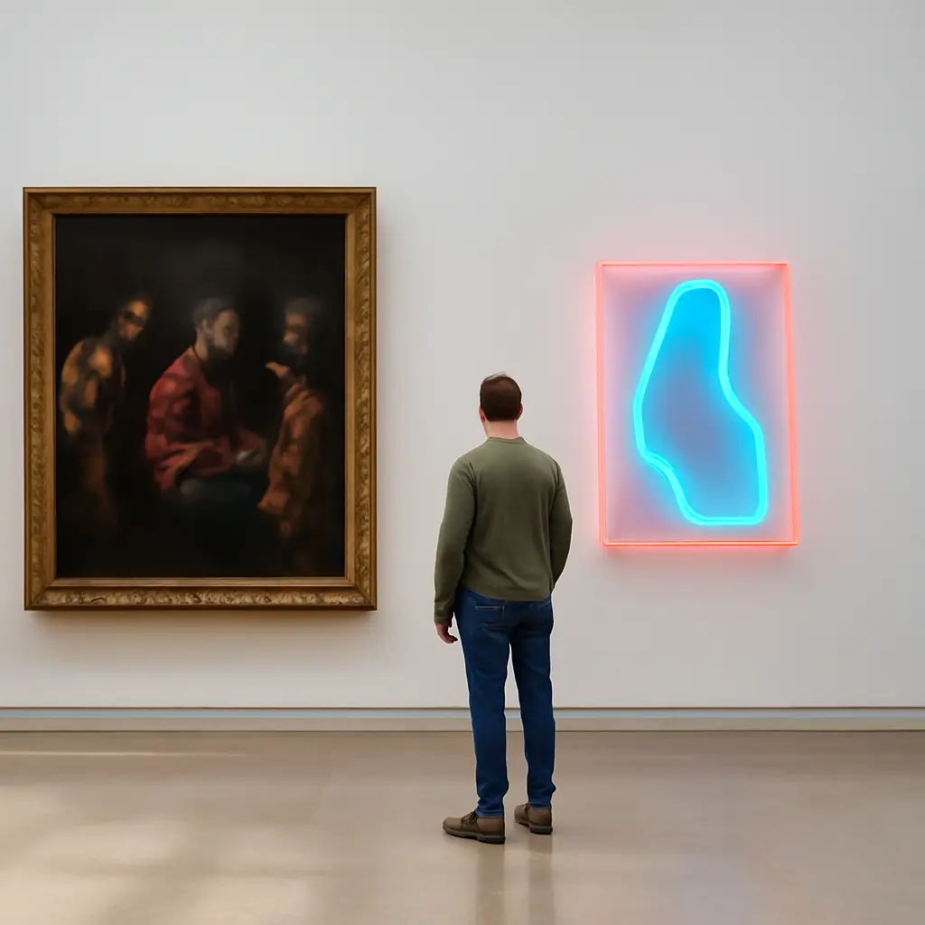
From Renaissance chiaroscuro to modern neon, color language evolves
Color is more than decoration: it guides attention, suggests depth, shapes emotion, and reflects the technologies available to artists. From Renaissance chiaroscuro—the modeling of forms through contrasts of light and shadow—to the electric hues of modern neon, artists have used color and illumination to make images feel dramatic, believable, or deliberately unreal. Art historians and museum collections document this shift through paintings, pigments, and later light-based works; together, they show how changing materials and viewing environments transformed color’s role in art.
Renaissance chiaroscuro and the language of light
Chiaroscuro is the use of strong contrasts between light and dark to give figures and objects a sense of volume. The term combines the Italian words for “light” and “dark.” The National Gallery of Art describes chiaroscuro as a technique for modeling three-dimensional forms through gradations of light and shadow. Although artists had long used shading, Renaissance painters developed it alongside perspective, close observation of the body, and increasing interest in naturalistic space.
From tonal modeling to dramatic focus
In early Renaissance painting, light and shadow could make a face, hand, or garment appear solid within a carefully organized scene. Leonardo da Vinci’s sfumato—soft transitions between tones and colors—extended this approach by blurring sharp boundaries. In later works by Caravaggio, concentrated illumination and deep shadow became more theatrical: bright figures seem to emerge from darkness, directing attention toward a decisive gesture or expression. Chiaroscuro therefore describes more than realistic shading; it can organize a composition and intensify its emotional meaning.
Pigment, surface, and historical context
Renaissance color was shaped by pigments, binders, and supports as well as by artistic intent. Ultramarine, traditionally made from lapis lazuli, was costly and often reserved for important passages, while earth pigments supplied more accessible reds, browns, and yellows. The Metropolitan Museum of Art’s essays on painting materials explain how pigment choice and technique affected color and durability. A dark ground could heighten the brightness of illuminated passages, but the painting’s appearance also depended on varnish, conservation, and the light under which it was viewed.
Color science expands the palette
The move from Renaissance tonal contrast toward modern color was not a simple replacement of shadow with brightness. It was also a history of new pigments, theories of perception, and ways of producing light. In the nineteenth century, artists increasingly considered how neighboring hues affect one another and how color changes under different conditions of illumination.
Impressionism and color in changing light
Impressionist painters often used short, distinct strokes and juxtaposed colors to suggest the changing effects of daylight. Rather than relying only on dark outlines and smooth tonal modeling, they could place complementary or contrasting hues beside one another, allowing the viewer’s perception to help blend the image at a distance. The National Gallery in London’s accounts of Impressionism emphasize artists’ attention to modern life and transient visual effects. This approach made color an active tool for conveying atmosphere, time, and perception.
New pigments and industrial color
Industrial chemistry expanded the range and availability of artists’ colors. Synthetic pigments such as cobalt blue and chrome yellow offered alternatives to some natural materials, while paint in portable tubes made outdoor painting more practical. These changes did not determine what artists painted, but they altered what could be painted easily and vividly. The Colour Index International, maintained by the Society of Dyers and Colourists and the American Association of Textile Chemists and Colorists, classifies colorants by their chemical identities, underscoring that “color” can refer both to a perceived hue and to a material substance.
Modern neon turns color into light
Neon marks a major shift because it is not simply pigment reflecting light: it is light produced by an illuminated source. In a neon sign, an electric discharge excites gas inside a sealed tube, which emits visible light. The term “neon” is often used broadly for luminous signs, though different gases and coatings can produce different colors. The Smithsonian’s National Museum of American History documents the development of electric advertising and signage as part of the transformation of urban streets and commercial culture.
The technology behind neon color
Neon gas produces a characteristic reddish-orange glow; other colors can be created with different gases, phosphor coatings, or colored glass. This means neon’s palette depends on engineering as well as design. Unlike a painted surface, a sign can remain conspicuously bright after dark and compete with surrounding illumination. The result changes how color is encountered: viewers see it as a source of light, often in motion-filled streets and at a distance.
Neon as art and urban communication
Artists have used neon to blur boundaries between fine art, advertising, language, and architecture. Bruce Nauman’s neon works, for example, use glowing words and phrases to make language feel immediate, spatial, and sometimes unsettling. The Whitney Museum of American Art’s collection and exhibition materials discuss neon’s significance in postwar art. In commercial settings, neon signs have also become markers of nightlife and place, while contemporary LED displays extend the same broad visual language through more energy-efficient electronic lighting.
Reading color across eras
Comparing chiaroscuro with neon reveals how artistic color depends on both representation and technology. A Renaissance painter could make a candlelit face seem to emerge from shadow by controlling pigment on a surface. A neon artist can make words or shapes emit light into the surrounding space. Between them lie changing theories of vision, new materials, electric infrastructure, and evolving audiences.
A useful comparison for viewers
When looking at an artwork, ask whether its color reflects light or produces it; whether contrast creates depth, directs attention, or communicates a mood; and how the material affects the viewing experience. These questions connect Renaissance painting to modern signage without treating one as merely a precursor to the other. They also help explain why color can function simultaneously as a physical material, a visual structure, and a cultural signal.
Conclusion: from painted shadow to luminous color
Renaissance chiaroscuro made light and darkness powerful tools for modeling form and guiding attention. Later advances in color science and industrial pigments widened artists’ options, while neon transformed color into an emitting, public-facing light. These developments show that color language evolves through artistic choices as well as materials, science, and social context. To explore the history further, compare a Renaissance painting with an Impressionist canvas and a neon artwork, paying attention to how each creates light, directs the eye, and shapes meaning.
Sources: National Gallery of Art, “Chiaroscuro,” https://www.nga.gov/learn/teachers/lessons-activities/elements-art/chiaroscuro.html; The Metropolitan Museum of Art, “The Materials and Techniques of Renaissance Painting,” https://www.metmuseum.org/essays/the-materials-and-techniques-of-renaissance-painting; The National Gallery, “Impressionism,” https://www.nationalgallery.org.uk/paintings/learn-about-art/what-is-impressionism; Colour Index International, https://colour-index.com/; Smithsonian National Museum of American History, “Neon: A Light History,” https://americanhistory.si.edu/explore/stories/neon-light-history; Whitney Museum of American Art, “Bruce Nauman,” https://whitney.org/artists/929